How to read a crypto chart at a glance
Learning how to read a crypto chart is the first real skill most traders pick up, and it is simpler than the wall of colors on your first exchange screen suggests. A price chart is just a record of what buyers and sellers agreed on over time. Once you can decode the four things every chart shows you (price, time, volume, and momentum), the rest is pattern recognition and practice. This guide walks through the core building blocks of technical analysis so you can look at any coin's chart and understand the story it is telling.
Technical analysis assumes that price action already reflects everything the market knows. Instead of trying to value a project from scratch, you study the chart to gauge supply, demand, and crowd behavior. It will not predict the future, but it gives you a framework for spotting where interest clusters.
Reading candlesticks
Most crypto charts default to Japanese candlesticks. Each candle represents one slice of time (one minute, one hour, one day) and packs four prices into a single shape: the open, close, high, and low.
- Body: the thick part shows the open and close. A green (or hollow) body means the price closed higher than it opened; a red (or filled) body means it closed lower.
- Wicks: the thin lines above and below the body mark the highest and lowest prices reached during that period.
- Long lower wick: buyers pushed price back up after a dip, a sign of rejection at lower levels.
- Long upper wick: sellers stepped in near the top, a sign of resistance.
A single candle rarely means much. What matters is the sequence: a run of green candles with rising bodies shows momentum, while candles with tiny bodies and long wicks signal indecision.
Choosing a timeframe
The same coin looks bullish on one timeframe and bearish on another. A 5-minute chart captures noise; a daily or weekly chart captures the broader trend. Beginners often make the mistake of zooming into tiny timeframes and reacting to every wiggle.
A practical habit is to check at least two timeframes before forming an opinion: a higher one to establish the overall direction, and a lower one to time your entry. If the weekly trend is up but the hourly is dipping, that pullback looks very different than a dip in a coin that is falling on every timeframe.
Support and resistance
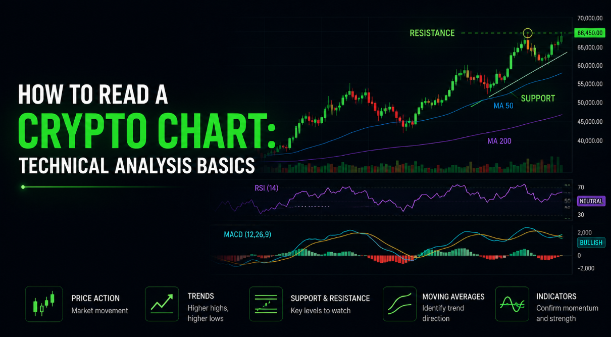
Support is a price level where buying has repeatedly overwhelmed selling, forming a floor. Resistance is the opposite: a ceiling where selling tends to win. These are not exact lines but zones, and the more times a level is tested, the more traders watch it.
When price finally breaks through resistance, that old ceiling often becomes new support (and vice versa) as traders reposition around it. Drawing a few horizontal lines at obvious past highs and lows is one of the highest-value habits in technical analysis, and it costs nothing.
Trendlines and volume
A trendline connects a series of higher lows in an uptrend or lower highs in a downtrend. It turns a messy chart into a clear slope and helps you see when a trend is weakening (price struggling to make new highs) or breaking.
Volume, usually shown as bars under the price, tells you how much conviction sits behind a move. A breakout on heavy volume is more trustworthy than one on thin volume, which often fizzles. Watch for these pairings:
- Rising price plus rising volume: a healthy, supported trend.
- Rising price plus falling volume: momentum may be fading.
- Sharp volume spike: often marks a climax or a major shift in interest.
Common indicators
Indicators are calculations layered onto the chart to summarize what price is doing. A few beginner-friendly ones cover most needs:
- Moving averages (MA/EMA): smooth out price to reveal the underlying trend. The 50-day and 200-day averages are widely watched; when a shorter average crosses above a longer one, many read it as bullish.
- Relative Strength Index (RSI): ranges from 0 to 100 and flags when an asset may be overbought (above 70) or oversold (below 30).
- MACD: tracks the relationship between two moving averages to highlight shifts in momentum.
Resist the urge to stack a dozen indicators. Two or three that you understand deeply beat a cluttered screen you cannot interpret. Indicators lag price, so treat them as confirmation, not prophecy.
Putting it together
Reading a chart well is about combining signals rather than betting on any single one. A textbook setup might be price bouncing off a long-standing support zone, on a higher timeframe uptrend, with volume ticking up and RSI climbing out of oversold territory. No single element guarantees anything, but stacked together they raise the odds that other traders see the same thing.
Your practical takeaway: start by opening a daily chart of a coin you follow, mark two or three support and resistance levels, add a single moving average, and simply watch how price behaves around those lines for a couple of weeks. That focused practice teaches more than any list of patterns.
This guide is educational and is not financial advice. Technical analysis is a tool for understanding probability and crowd behavior, not a crystal ball. Always manage risk, never trade money you cannot afford to lose, and do your own research before making any decision.